On a recent trip to my home town, I was reminded once again how The Advertiser, Adelaide’s only daily newspaper, is just… terrible.
Without even trying to find fault, the complete incompetence of that newspaper bursts forth from its tabloid pages.
And forget about the actual JOURNALISM for a second! How about some FREAKING common sense!?!
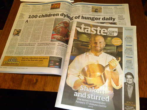
Nice placement of the FOOD SECTION:

100 children dying of hunger daily… Shaken and stirred! The secret to Alessandro Pavoni’s 17-minute risotto! MmmmMMMmmm…
And this one’s been frustrating me for years. I can’t believe they haven’t redesigned their reader opinion results graph yet.
Firstly, let’s see how a newspaper with a trace of common sense presents their results. This is from Melbourne’s Herald Sun (oddly enough, owned by the same company – News Ltd):

Quite clearly, more people voted “NO” than “YES”. Okay. All good.
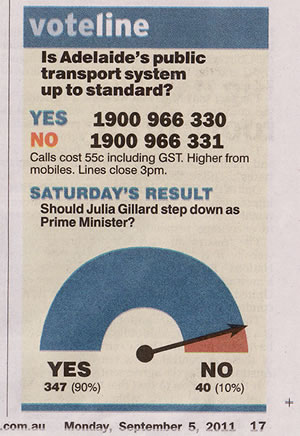
But how does the Adelaide Advertiser present their reader results? Like this:

WHY!?!
WHY DO THEY DO THIS!?!
What is the point of THAT ARROW? It serves NO PURPOSE! Other than to confuse the reader.
If it’s a majority of YES, the arrow points to NO! IT DOESN’T MAKE ANY SENSE!
It’s like they stole a graphic from the 2007 Federal election and slapped an arrow on it for no reason.
And it’s not like this is a recent graph design. From memory they started printing that graph maybe 2008 or 2009? And they’ve been doing it ever since.
Adelaide is a one paper town, badly in need of a broadsheet alternative.
It fills me with great annoyance every time I return and catch a glance at the paper on my parents’ kitchen table. At least I don’t have to look at it every day.
If you do, you have my sympathy.
Kind regards,
David M. Green
Newspaper critic.
Leave a Reply